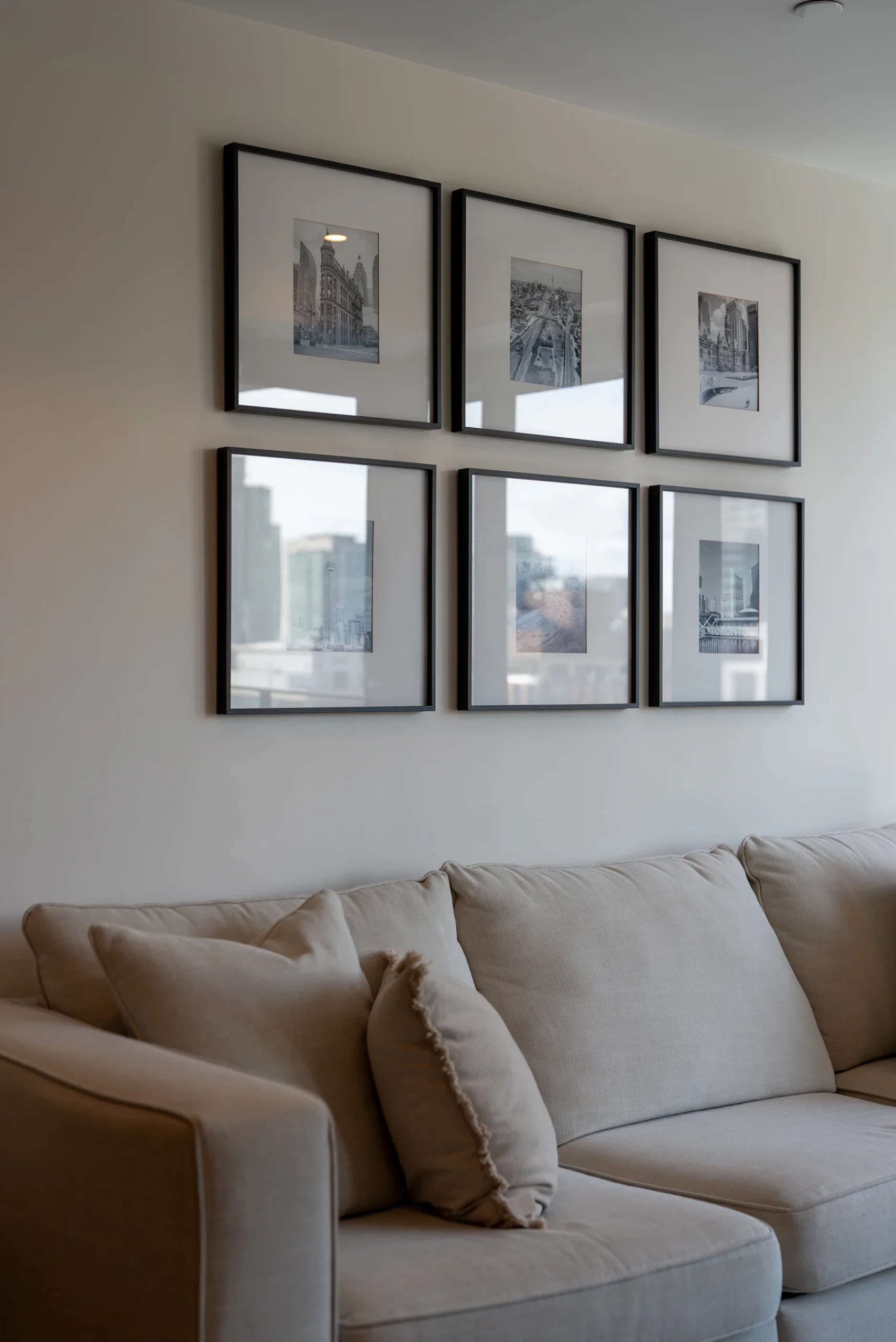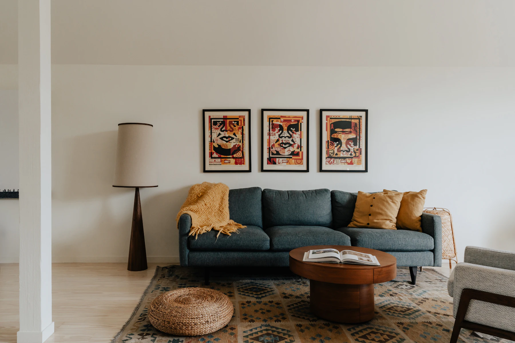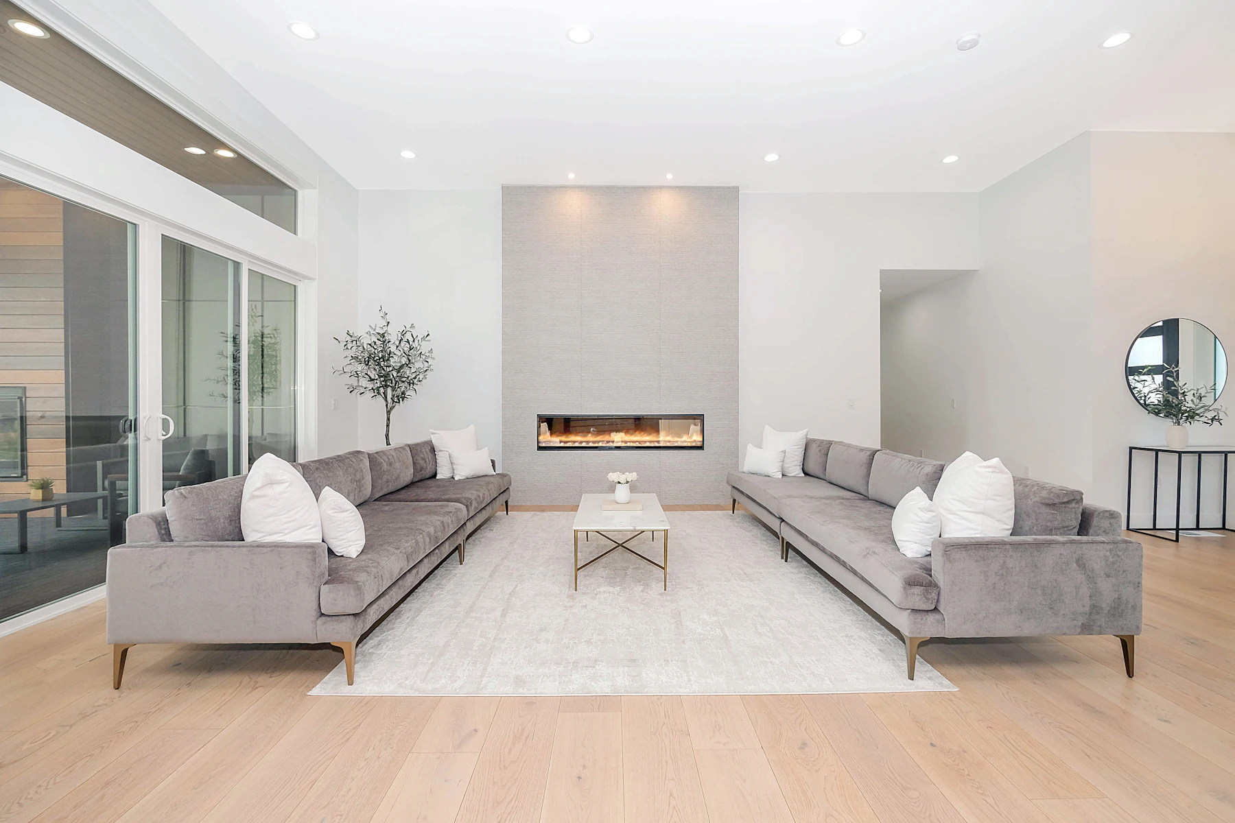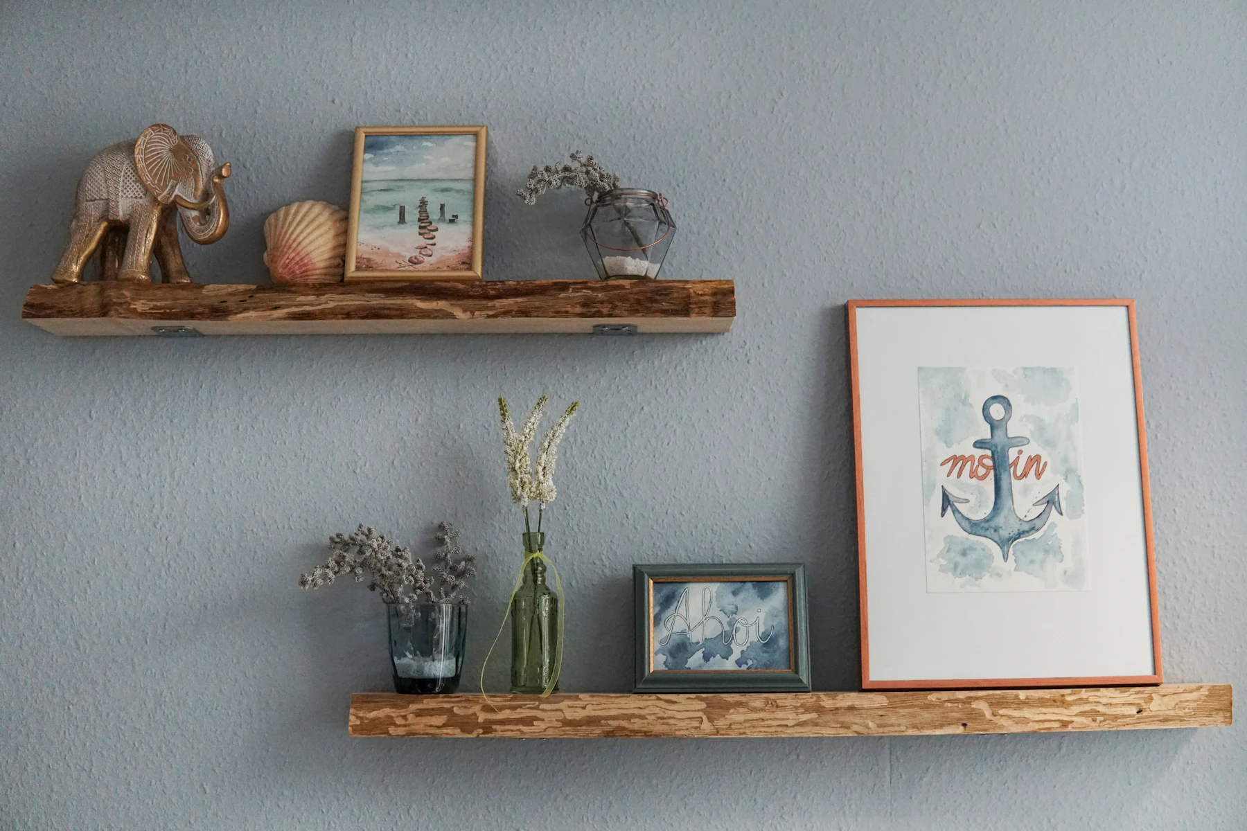
The finishing layer of a room, the objects on the mantel, the console, the coffee table and the shelves, is where personality shows. It’s also where many rooms go wrong: too many small things scattered evenly, or a few lonely objects lost on a big surface. Designers call a well-composed group of objects a vignette, and composing one is less mysterious than it looks.
Odd numbers feel natural
Groups of three or five tend to look more relaxed and interesting than pairs or fours. An even number invites the eye to split the group into matching halves; an odd number keeps the eye moving around the arrangement. It’s the same principle photographers and painters use.
Pairs still have their place: matched lamps on a sideboard, candlesticks flanking a mirror. Symmetry is perfect for formal focal points. But within a vignette, odd numbers almost always win.
Build a triangle
Arrange objects so their heights form a triangle: one tall element (a lamp, a vase of branches, a framed piece leaning against the wall), one medium (a stack of books, a bowl), one low (a small box, a candle, a sculptural object). The eye travels up and down the slope, and the group reads as one composition rather than three separate things.
Layer front to back
Depth makes a vignette look curated rather than lined up. Lean a piece of art or a mirror at the back, place a lamp or tall vase in the middle, and set smaller objects in front, slightly overlapping. Stacked books are a designer’s best friend: they add height under a small object, horizontal lines to balance vertical ones, and a little personality.
Give it room to breathe
Empty space is part of the composition. A surface crowded edge to edge looks cluttered no matter how beautiful the objects are. Leave about a third of a surface clear, and resist filling every shelf.
Surface by surface
- Mantel: start with a large anchor (art or a mirror), then build asymmetric groupings or a formal symmetrical arrangement on each side. Keep the center clear enough to let the anchor breathe.
- Console or sideboard: lamp or tall element on one end, a lower grouping on the other, art above tying it together.
- Coffee table: a tray to corral small things, a stack of books, something living (flowers or a plant) and something sculptural. Leave room for cups.
- Bookshelves: mix vertical rows of books with horizontal stacks, and give every few shelves an object or small framed picture. Zigzag the objects across the unit so the eye moves through it. Keep a consistent color thread.
- Nightstand: lamp, a book, something personal, and enough clear space for a glass of water.
Choose objects with meaning
The best vignettes aren’t bought in one trip. A vase from a trip, a piece of pottery from a local artist, a grandparent’s silver bowl, books you actually read, a stone from the lakeshore: objects with stories make a house look like you, which is the whole point. Von’s showroom was always full of distinctive vases, prints, stemware and small treasures for exactly this reason. They’re the punctuation in a room’s sentence.
Edit, then edit again
When a vignette isn’t working, the answer is usually to remove something, not add it. Take a photo with your phone. Photos flatten a scene and make imbalances obvious. Then try taking one object away. Rotate seasonally: put some pieces away, bring others out. Rooms feel fresh without buying a thing.
The takeaway
Group in odd numbers, build triangles of height, layer from back to front, mix shapes and textures, leave breathing room and choose objects with stories. Then step back and edit. Styling is a skill, and like any skill, it improves with practice.