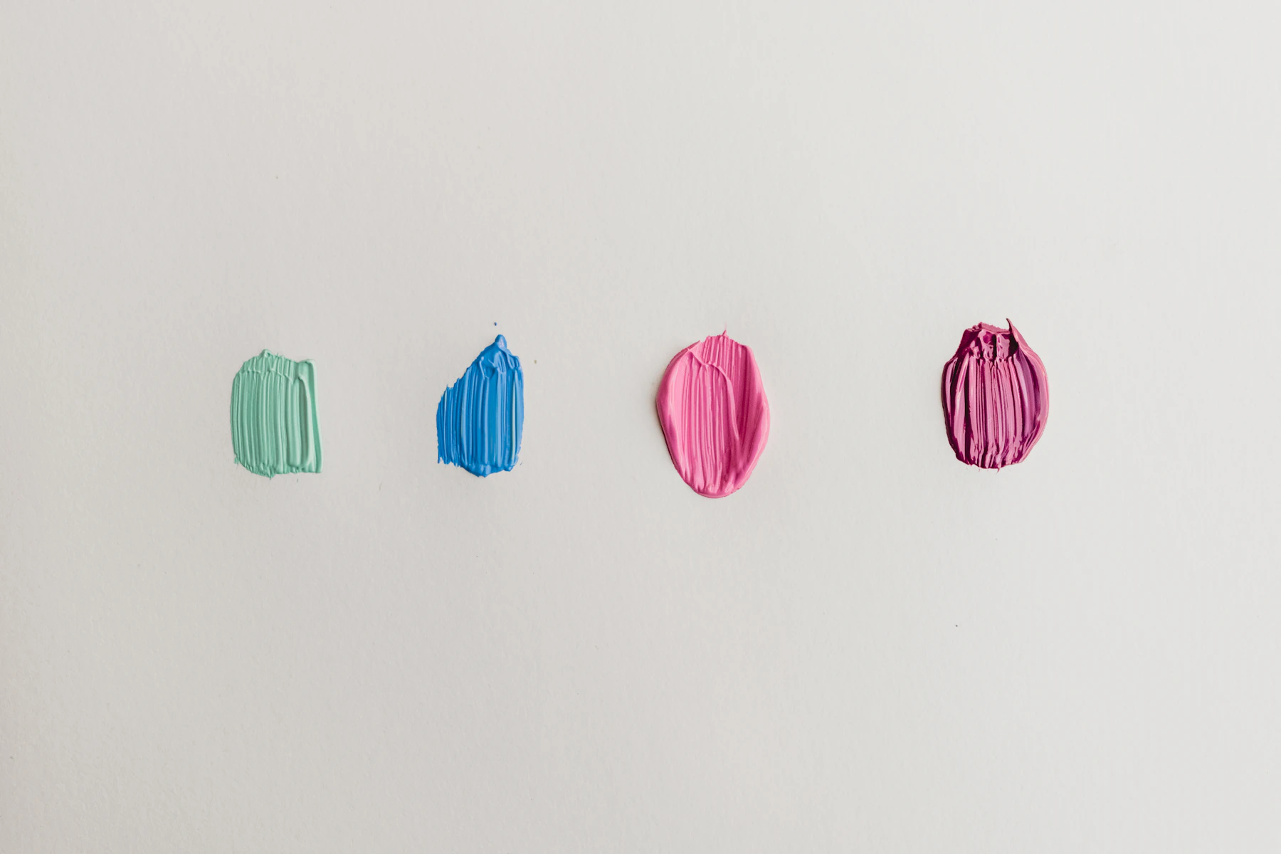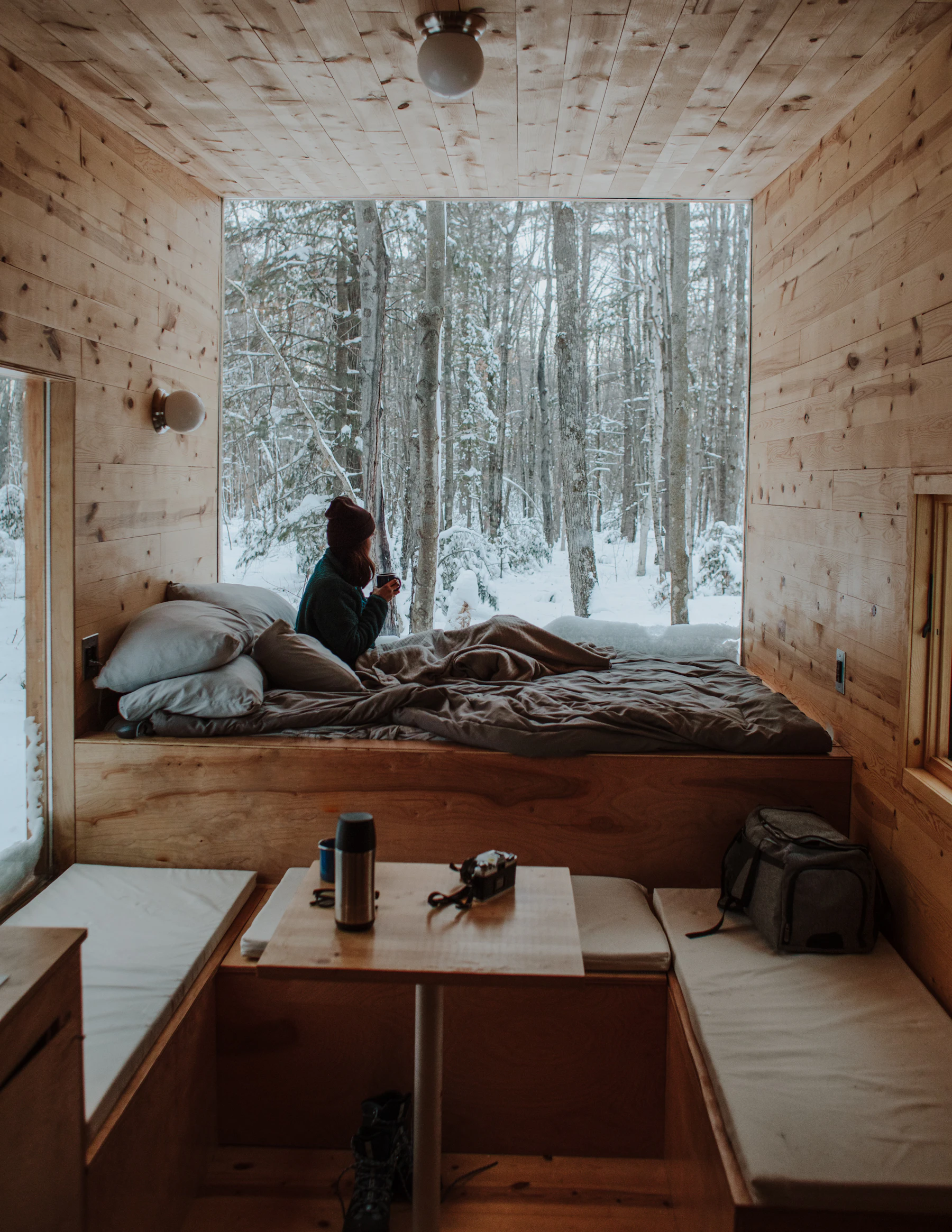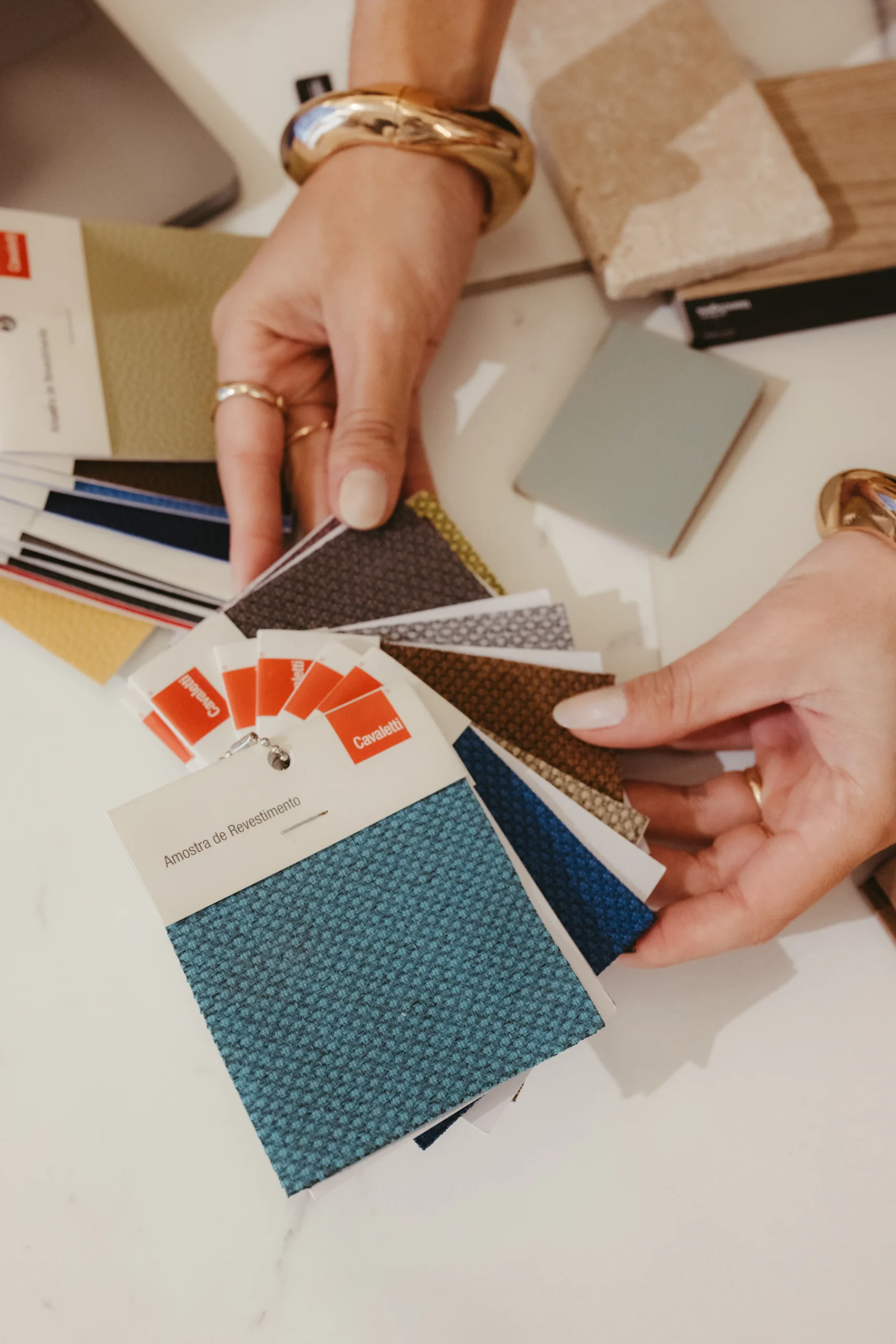
Color is where many people freeze. There are thousands of paint chips, endless fabrics, and the nagging fear of a room that looks like a circus or a waiting room. The 60-30-10 rule is the simplest antidote: a ratio that tells you not which colors to use but how much of each.
The rule in one sentence
About 60 percent of a room is a dominant color, about 30 percent a secondary color, and about 10 percent an accent.
- 60% (dominant): usually the walls, plus large elements like a big rug or a sectional. Often a neutral or a softened color.
- 30% (secondary): furniture upholstery, drapery, an accent wall, cabinetry. It supports the dominant color and adds interest.
- 10% (accent): pillows, art, a lamp, flowers, a vase, a painted door. The spark.
Why the ratio works
Our eyes like hierarchy. When colors are present in roughly equal amounts, nothing leads; the room feels busy and unresolved. When one color clearly dominates, a second supports it and a third appears in small doses, the eye has a resting place, a path and a reward. It’s the same reason a good outfit tends to be a main color, a supporting color and one accessory that pops.
The ratio also controls intensity. A saturated color that would be overwhelming at 60 percent is delightful at 10. That’s how you get to use the cranberry, the emerald or the copper you love without living inside it.
A worked example
Picture a North Idaho living room:
- 60%: warm white walls and a large oatmeal-colored wool rug.
- 30%: a deep forest-green sofa, green-and-cream drapery and a walnut coffee table.
- 10%: copper and rust: a copper lamp, rust-toned pillows, a painting with autumn tones.
Swap the 30 and the 10 and you get a completely different room from the same three colors. Proportion is as powerful as palette.
Woods, metals and neutrals count too
People often forget that wood floors, stone fireplaces, brass hardware and black window frames are colors. A honey oak floor is a large block of warm orange-yellow; it belongs in your 60 or 30 percent. Plan around it rather than pretending it isn’t there.
Likewise, “neutral” isn’t one color. Whites, creams, greiges and taupes each lean warm or cool. Pick neutrals that share an undertone (see our guide to paint undertones).
Choosing the three colors
If you’re starting from scratch:
- Start with something you love: a rug, a painting, a fabric, a favorite piece of pottery. Pull the three colors from it. The artist has already balanced them for you.
- Or use the color wheel. Analogous schemes (neighbors on the wheel, like blue, blue-green and green) are calm. Complementary schemes (opposites, like blue and orange) are lively. Use the complement as the 10 percent.
- Consider the light. North-facing rooms get cooler light and suit warmer colors; sunny south-facing rooms can handle cooler palettes.
When to bend it
The 60-30-10 rule is a starting point, not a law.
- Monochrome rooms use one color in many shades and textures. The ratio still applies, just to light, medium and dark versions of the same hue.
- Eclectic rooms, Von’s specialty, often have more than three colors. They work when one color is clearly dominant and the rest are threaded through in smaller, repeating doses.
- Open floor plans should share the 60 percent across the connected spaces, then vary the 30 and 10 by zone so the areas feel related but distinct.
The takeaway
Color confidence comes from proportion. Decide what will dominate, what will support and what will sparkle, and the paint chips stop being scary. Bring a fabric or a photo of a room you love to a consultation and Von will help you find the ratio hiding in it.
Further reading
- The color wheel (Wikipedia)