You found the perfect sofa in the showroom. At home, it looks… wrong. Too big, too small, too heavy, too dainty. Nothing is wrong with the sofa. The problem is scale (how big it is relative to the room) and proportion (how big it is relative to everything around it).
Scale mistakes are the most common reason a room with beautiful things still doesn’t feel right. The good news: a few ratios cover most situations.
Scale vs. proportion
Scale compares an object to the room and to the human body. A massive sectional in a small den is out of scale; so is a delicate loveseat in a great room with 18-foot ceilings.
Proportion compares objects to each other, and parts of an object to its whole. A tiny lamp on a large table, or a coffee table half the length of the sofa it serves, is out of proportion.
The two-thirds rule
If you remember one ratio, make it two-thirds. It shows up everywhere because it creates a pleasing imbalance: one element clearly dominant, the other clearly supporting, neither fighting.
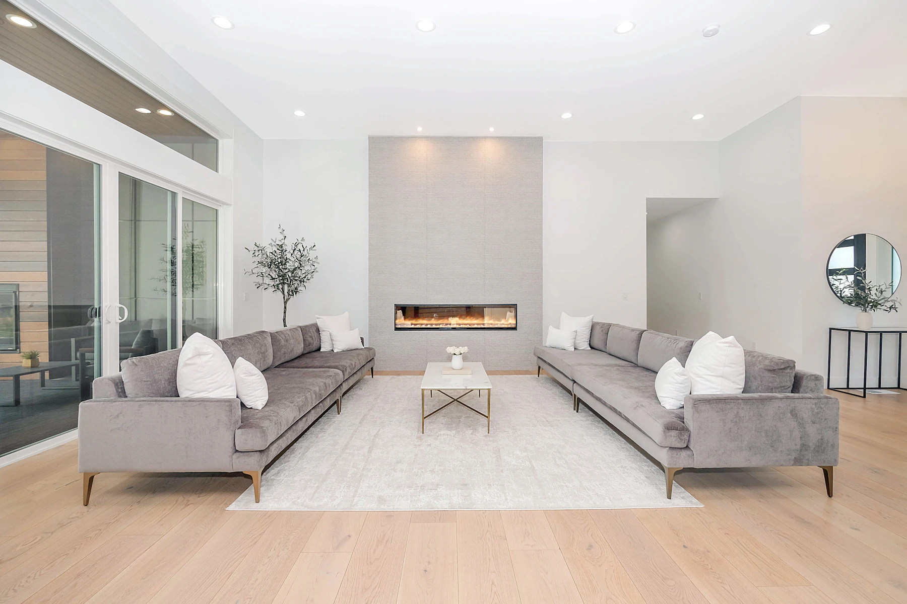
- Sofa to wall: a sofa about two-thirds the length of the wall it sits on.
- Coffee table to sofa: roughly two-thirds the length of the sofa.
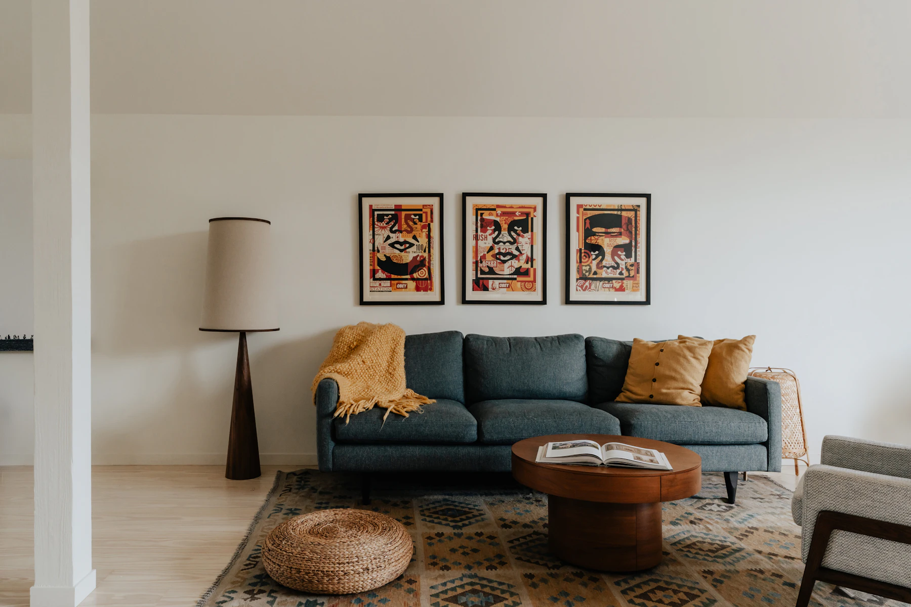
- Art to furniture: art (or a grouping) about two-thirds the width of the sofa, console or bed below it.
- Rug to room: large enough that a border of floor shows all round, with the furniture sitting on it (see our rug guide).
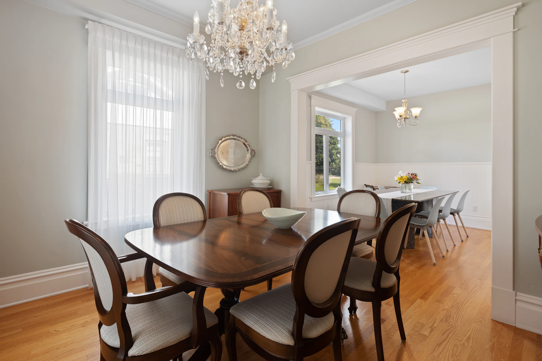
- Chandelier to table: one-half to two-thirds the width of the table.
The two-thirds proportion is a close cousin of the golden ratio (about 1 to 1.6), which artists and architects have used for centuries. You don’t need a calculator, just the habit of asking “is one of these clearly in charge?”
Heights matter as much as widths
Rooms are three-dimensional, and the vertical scale is often neglected:
- Tall ceilings need tall things: high-backed chairs, taller lamps, large art, drapery hung near the ceiling, a substantial chandelier. Low furniture in a two-story room looks like doll-house furniture.
- Low ceilings call for lower, longer pieces and an emphasis on horizontal lines, with drapery still hung as high as possible to draw the eye up.
- Vary the heights in a room. If every piece tops out at 30 inches, the room looks flat. Add something tall (a bookcase, a plant, a floor lamp, a tall cabinet) to lift the eye.
Visual weight: why size isn’t only size
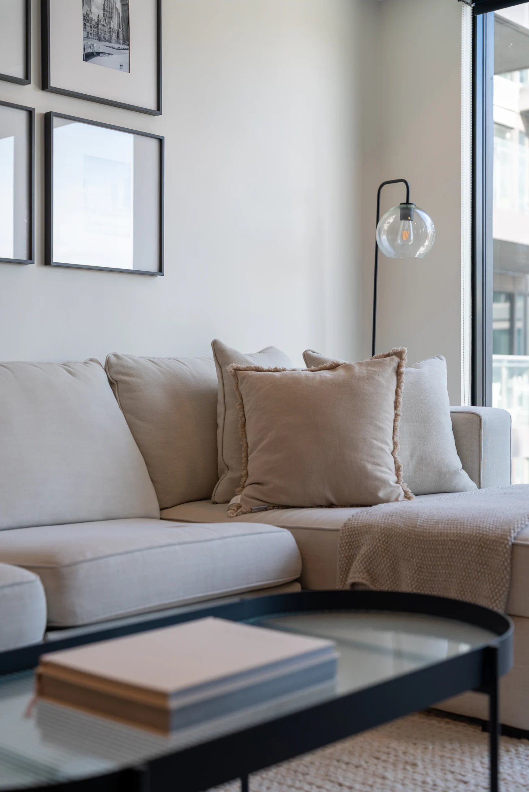
Two chairs of identical dimensions can look completely different. A skirted, upholstered armchair in a dark fabric has heavy visual weight; an open-armed chair on slim legs in a pale fabric feels light. Dark colors, solid bases, bold patterns and thick materials add weight. Legs, glass, light colors and open frames reduce it.
Use this to balance a room. A heavy sofa on one side can be balanced by a pair of lighter chairs on the other. In small rooms, choose pieces with legs and lighter visual weight so you can see the floor beneath them. The room reads as larger.
How to check scale before you buy
- Measure the room and draw it on graph paper, or use painter’s tape to mark the footprint of a new piece on the floor.
- Stack boxes or use a sheet to mock up height. A sofa back at 30 inches looks very different from one at 38.
- Check the doorways, stairs and turns the piece must travel through to get there.
- Remember that showrooms have high ceilings and huge spaces. Everything looks smaller there than it will at home.
When to break the rules
An oversized piece, used on purpose, can be magnificent: a huge painting in a small powder room, an enormous lantern over a modest entry. The difference between a mistake and a statement is commitment. Go clearly, confidently big on one element and keep its surroundings simple.
The takeaway
When a room feels off, check scale before you blame style. Size furniture to the room and to its neighbors, use the two-thirds rule as a starting point, vary heights and balance visual weight. Try the design calculators for rugs, art and lighting.
Further reading
- The golden ratio (Wikipedia)